Turning Over a New Leaf: Master Fall Fashion with the Color Wheel
As cooler mornings set in and leaves start to fall, it's time to swap out sandals and loafers for boots and jackets. The smell of cider and pumpkin spice fills the air, signaling a change not only for the trees but also for your wardrobe.
Nature gives us great inspiration. Take a look at a sugar maple’s leaves as they shift from vibrant green to rich shades of red, orange, and yellow. As temperatures drop, warm earth tones naturally feel more fitting.
You don’t need to overthink matching these tones, but if you’re unsure, the color wheel can be a helpful guide. Complementary colors (those that enhance each other) and analogous colors (those that are close on the wheel) work beautifully with fall favorites like burnt orange, deep greens, and browns.
Understanding the Color Wheel
The color wheel has three main sections to it that help you understand the idea of complementary, analogous, monochromatic, triad, and so forth.
Looking at the wheel above and realizing how much actually goes into color theory can become a little daunting. Don’t worry, we aren’t going to spend too much time on everything above. Instead I am going to walk you through how to look at the color wheel and use it
Fall Color Palette Essentials
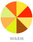
Check out the warm colors above. Stick with warmer colors during these colder autumn days. (earth tones, warm hues like burgundy, mustard, olive green). Connect fall colors with the environment—leaves changing, cooler weather.
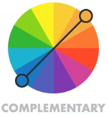
Complementary colors are simply those that sit opposite each other on the color wheel. When paired, they create a bold, balanced look. That's why red and green are often used together during the winter months. Unfortunately, thanks to popular culture, some complementary color pairings, like red and green, are strongly associated with holidays like Christmas. To move beyond these associations, try experimenting with different shades of those colors for a fresh, seasonally appropriate look.
Fashion Tip: How to Avoid Clashing and Keep Your Outfit Balanced
When using complementary colors, the key to avoiding clashing is to balance intensity. Instead of choosing bold, saturated versions of both colors, pick one dominant color and tone down its complement. For example, if you’re wearing a deep, burnt orange sweater, try pairing it with a more muted forest green instead of a bright green. This keeps the look cohesive and less jarring.
Another way to maintain balance is through proportion. Use complementary colors in different amounts, like featuring one color as the main piece and the other as an accent. A navy suit with a mustard yellow pocket square or shoes, for instance, creates a well-balanced, sophisticated outfit without overwhelming the look.
Finally, don’t forget about neutrals! Mixing in neutral tones like brown, gray, or beige can help ground the outfit, creating a smoother transition between your chosen colors.
The Fit: Fall Outfit Inspiration Based on the Color Wheel
Notice the maroon shirt compliments the tan color of the suede chukkas. The color wheel in action!
Warm-Toned: Examples using warm tones like reds, oranges, and yellows. Notice how the wine-colored maroon flannel button-down not only adds depth but also emphasizes the warmth of the color palette. The texture of the flannel complements the cozy, rich hues, enhancing the fall feel.
Cool-Toned: Incorporate cool tones like navy, deep purples, and forest greens. Lighter-colored denim can help balance out the cool tones, preventing the outfit from feeling too heavy or overpowering.
Neutral Combinations: Using neutral tones like browns, grays, or black with pops of fall colors creates a subtle, understated look. For instance, the black vest helps transition between warmer tones and cooler blues, creating a cohesive, balanced outfit.
Get the look! Investment Piece
Shirt: Proper Cloth- The Beacon Flannel Shirt $175
Jeans: Proper Cloth- The Japanese 12oz Stretch Jeans $250
Shoes: Thursday Boots- Scout Chukkas- Cognac Suede $160.00
Jacket: Peter Millar- Essex Vest $245
Get the Look! Smart Value
Shirt: Eddie Bauer- Eddie’s Favorite Flannel Classic Fit Shirt- Solid $40.00
Jeans: Goodfellow & Co.- Men’s Slim Fit Jeans $35.00
Shoes: Jim Green- Rough Out Vellie- Chestnut $99.00
Jacket: Magellan- Outdoors Men’s Campfire Quilted Vest $35.00


